How to use the portal
The Canadian Neighbourhood Change Explorer enables you to visualize change in the characteristics of neighbourhoods over time in several ways.
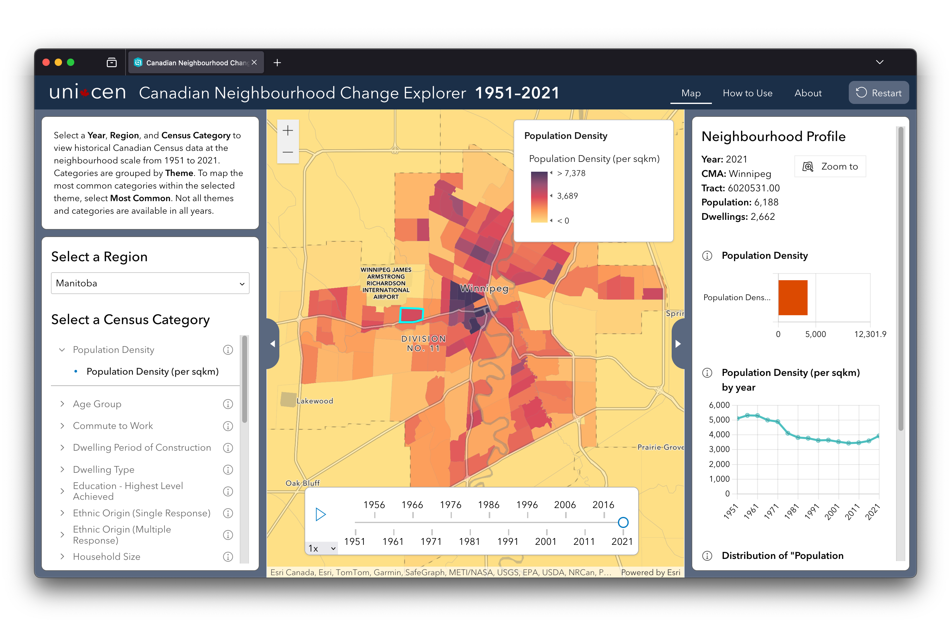
- Selector Area
- Profile Area
- Restart Button
- Time Slider
- Legend
- Map
Select a census category and year
To map neighbourhood charactertics or learn about the characteristics of a specific neighbourhood on the map, you can select a Census Category in the Selector column at the left of your screen and the Census Year in the time slider at the bottom of your screen.

Select a Census Category. When you first open the portal, the Census Category shown on the map is population density. You can select a different Census Category from the list at the left of your screen. Categories are grouped by Theme.
After a category is selected, the map shows the category’s percentage within its theme — for example, the percentage of all dwellings constructed before 1960.
In addition to mapping a single category, you can also choose to map the ‘Most Common’ category in each neighbourhood.
Select a Year. Use the time slider to change the Census year. The ‘play’ button cycles through the years for which data are available. You can speed up or slow down the player by selecting a rate at the bottom left of the time slider. Faster speeds may not refresh properly on slower computers.

Navigating the map and selecting a neighbourhood
When you first open the portal, the map displays a randomly selected region of the country. You can pan and zoom the map, just like other popular mapping tools.

Switch regions. You can change the displayed region by selecting another one from the ‘Select a Region’ list.

Select a Neighbourhood. Click a neighbourhood on the map to learn more about it.
If you lose track of which neighbourhood you have selected, you can click ‘Zoom to’ at the top right of your screen.

About your selected neighbourhood
When you select a neighbourhood on the map, several charts appear in Neighbourhood Profile column at the right of your screen. Mousing over elements in the charts reveals additional information.

What are the most important categories in your neighbourhood? The Bar Chart shows each category's percentage within the selected Theme.

How has your neighbourhood changed over time? The Change Over Time Chart shows the category’s values for each Census year for which data are available, enabling you to visualize change over time.

How does your neighbourhood compare to all the others in same metropolitan area? For the selected category, the Comparison Chart shows the selected neighbourhood’s value in relation to all the other neighbourhoods in the same Census Metropolitan Area. The median neighbourhood is also shown. (This chart is not shown when ‘Most Common’ is selected.)
The Income variables are a bit different


The Bar Chart shows the neighbourhood’s median and average income in dollars.
Inflation erodes the value of money over time, so displaying the nominal dollar amounts for each year in the Change Over Time Chart would not be meaningful. As $100 had more purchasing power in 1981 than in 2021, comparing dollar values across the two years would be like comparing apples to oranges.
Instead, we show the income quintile in which the neighbourhood falls. Imagine that we order all of the neighbourhoods in the Census Metropolitan Area from lowest to highest income and divide them into five equally sized groups. These groups are called quintiles.
This enables an ‘apples-to-apples’ comparison of how well off the neighbourhood is across time. In the example shown, the neighbourhood starts out in the second quintile, meaning that it is above the median. As the years go on, its income level relative to the other neighbourhoods declines. By 2006, it is in the lowest quintile, the bottom 20% of the distribution.
The Comparison Chart, Change Over Time Chart, and Map Legend use the same colour scheme to indicate the quantiles.
If no neighbourhood is selected, the quintile calculation includes all neighbourhoods country-wide within the selected Census year. Once you select a neighbourhood, the quintiles are calculated in relation to the metropolitan area where it is located, and neighbourhoods in other metropolitan areas are faded out.
Last update: March 18, 2024