Assignment 3: Visualization + Data Structures

Worth: 10%
Due: November 20th at 11:59 pm
Marking Scheme: a3_marking_scheme
A note about this and past assignments
Assignment 1 and Assignment 2 both involved sifting through someone elses code and adding additional functionalities. While this is a great skill to have (and one which is necessary for practical programming), these assignments did not allow for any creativity or flexibility.
With this in mind (and also based on some of your feedback from the mid-term review) I’ve created Assignment 3. For this assignment you will be able to write all of your own code; moreover you will have some freedom in selecting your data and how you’d like to visualize it.
If you have any feedback on this Assignment or any other ones, feel free to email me @ jmorra6@uwo.ca with any suggestions or comments. Of course, also please do feel free to email me or come to office hours (or book a Zoom) if you need any help.
The idea
You will be picking one or more datasets from The Princeton Intro CS Repository or The UCI Machine Learning Repository (or from somewhere else… just cite where you got it from)
You will create
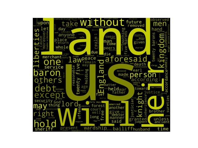
3 *different* visualizations. You could choose, for example, to use a scatter plot to illustrate some data (or a pie chart, or a box plot, or a histogram, etc.), or you could go the less traditional route and use something like a word cloud.Where necessary (i.e. moreso for more traditional plots like scatter plots, pie charts, etc.) you will need an appropriate title and axis titles; you will also be marked on how your graph looks (i.e. good spacing, appropriate scale).
You must create and implement your own
list(s),tuple(s), anddictionary(ies)somewhere in your code (i.e. you might, for example, use a dictionary to store your data and extract the keys and values into lists for your plot). You will needat least 1 of each data structurewhich you are using in the process of creating your visualizations.
More on the above point
You do not need 1 data structure for each plot; you can mix and match the 3 types… when marking we are only looking to see that you are somehow using dictionaries, lists, and tuples.
As long as you create and use them somewhere in the process of creating your visuals, it’s good. You wouldn’t, however, get the mark for a dictionary if you, for example, just created a dictionary such as {"James": "car", "Bob": "duck"} and printed it.
Below are a few samples for your reference.
Sample 1
A scatter plot showing that happiness is correlated with GDP per capita.
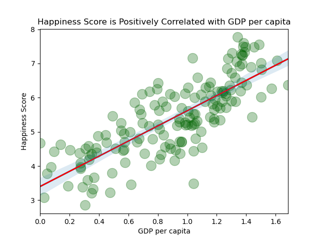
source: World Happiness Report
Sample 2
A bar graph which weakly shows (for this school) that more study time leads to higher grades, but also that over-studying could be less effective.
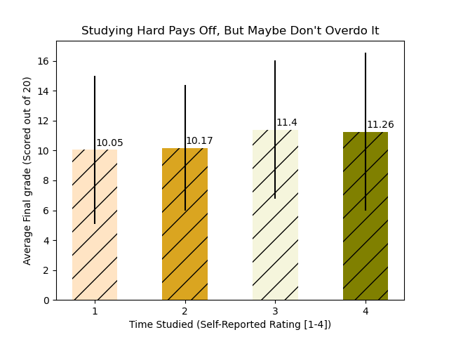
source: Student Performance
What’s the point?
I want to make sure that you can do 2 things:
Visualize some data with Python
Create and implement lists, tuples, and dictionaries
A resource to get started:
This resource is good, but you can use any resource and any plotting/visualization library that you want (matplotlib, pandas, seaborn, bokeh, etc.).
How you will be marked:
What to submit (in zipped folder)
a3.py: a Python file containing your code
v1.png: your first visualization
v2.png: your second visualization
v3.png: your third visualization
ref.txt: Cite the datasets you used here and indicate which reference corresponds to which visual(s). The format doesn’t matter, so long as you link to what dataset or datasets you used.